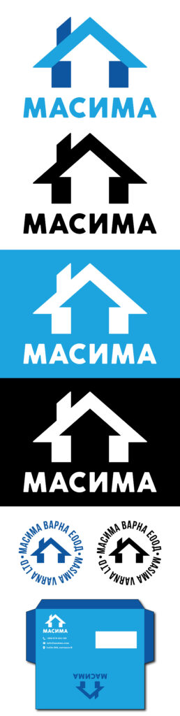
As part of my Bachelor’s degree, I completed a graphic design course that required students to create branding for a local business. For this project, I developed the Masima branding design, a full visual identity for a property management company based in Bulgaria.
The objective was to create a simple, professional, and trustworthy brand identity. Since Masima operates in the real estate sector, the branding needed to reflect stability, reliability, and structure. Additionally, the designs had to be easy to apply across both digital and print formats.
Project Elements:
- Logo Design & Variations
The logo uses bold, clean typography to project strength and professionalism. I created several variations, including horizontal, vertical, and single-color versions. This ensures it remains functional across different formats and sizes. - Classical Ink Stamp Concept
To add an official and traditional feel, I designed a custom ink stamp. This concept was inspired by classic Bulgarian administrative stamps, often seen in real estate documents. It helps reinforce trust and heritage. - Wallpaper / Background Pattern
To complete the brand system, I designed a repeating background pattern. The pattern uses simplified forms from the logo to create a clean and minimal visual texture. It works well for business cards, office branding, and digital backgrounds.
Through this Masima branding design project, I gained hands-on experience in building brand identity systems. Not only did I refine my visual design skills, but I also learned how to communicate a business’s values through design. Overall, this project helped me bridge academic theory with real-world application.